In this Odoo 16 tutorial, we will see how to write field widgets in OWL. What are the standard props, how to commit field content to the database, lifecycle hooks, listening to Bus events for tabs switching, extracting props from XML attrs, and more!
With version 16, Odoo continued its migration to its Component Oriented frontend framework OWL (version 2). Thanks to a solid legacy Framework adapter you could still write your fields widget the old way, but now is a good time to migrate your code. Now even the field widgets are written in OWL and this is what we will discuss here.
Let's go step by step and create a basic field widget.
A field Widget is now a pure OWL Component
We will make the most basic widget. A presentation widget with no interaction for now.
This widget will simply display the content of a field (preferably Text) inside a <pre> tag, to make it look like it's a Code block:
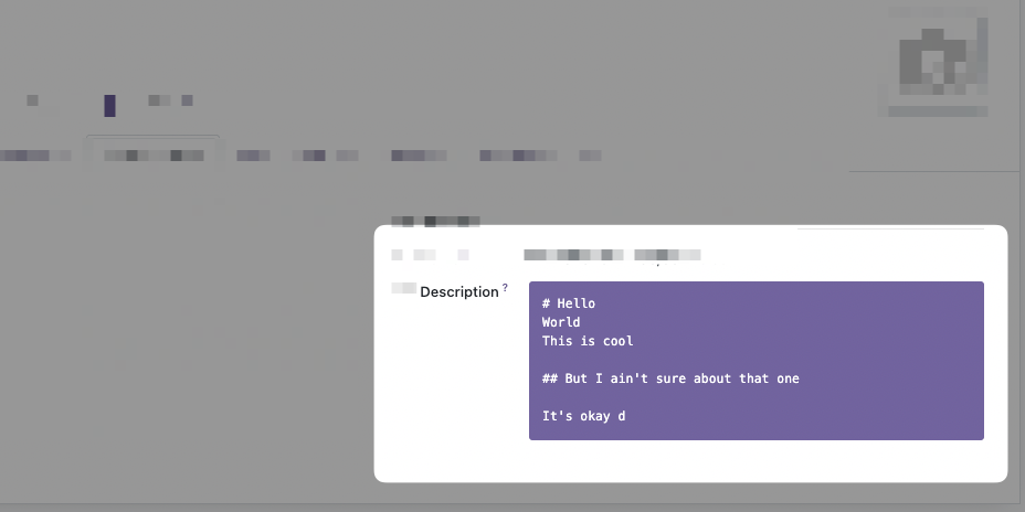
The JavaScript Field Component
This widget can be written with a very small amount of JavaScript, let's create a file called "static/src/js/code_field.js" with this:
/** @odoo-module **/
const {xml, Component} = owl;
import { standardFieldProps } from "@web/views/fields/standard_field_props";

export class CodeField extends Component {
    setup() {
        // This setup is useless here because we don't do anything
        // But this is where you will use Hooks
        super.setup();
    }
}

CodeField.template = xml`<pre t-esc="props.value" class="bg-primary text-white p-3 rounded"/>`;
CodeField.props = standardFieldProps;
This looks like a standard OWL Component, except that it has standardFieldProps as props. We will look more into it later in that course.
Add the field to the "fields" registry
What is shown above is just a Component, now we need to add that Component to the "fields" registry. For that we have to import the registry and add our field to it:
/** @odoo-module **/
const {xml, Component} = owl;
import { standardFieldProps } from "@web/views/fields/standard_field_props";
// Import the registry
import {registry} from "@web/core/registry";


export class CodeField extends Component {
    setup() {
        super.setup();
    }
}

CodeField.template = xml`<pre t-esc="props.value" class="bg-primary text-white p-3 rounded"/>`;
CodeField.props = standardFieldProps;

// Add the field to the correct category
registry.category("fields").add("code", CodeField);
The name you choose here "code" is very important because this is what you will use on the field : <field ... widget="code"> .
Adding the JS to the manifest.
Now in our __manifest__.py we add that JavaScript file:
{
    # ...
    "depends": ["base", "web"],
    "data": [],
    "qweb": [],
    "assets": {
        "web.assets_backend": [
            "/my_module/static/src/js/code_field.js",
        ]
    },
	# ...
}
And this is enough! You can use it directly on your field inside a view like so:
<field name="description" widget="code" />How did we get the value?
You may have noticed on the inlined template that we use props.value:
<pre t-esc="props.value" class="bg-primary text-white p-3 rounded"/>With t-esc we display props.value which is the content of the Field, in the database/from python, for that record, that we are visualizing.
That means that the parent Component of our Field widget gave us data, or props, at one point inside the Component Tree. The parent in question differs from contexts, but is usually the View Component, think FormView, TreeView, etc.
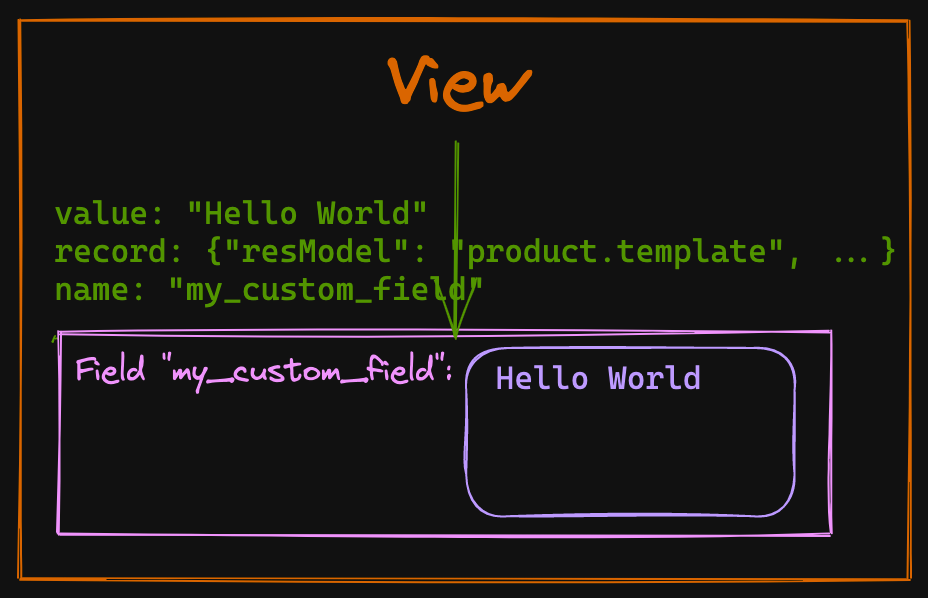
Our widget will then use these props and do whatever is needed to render the data adequately, allow editing of that value, save that value, etc. So what are these props we are dealing with?
A field widget gets the standardFieldProps "props".
Value is not the only prop given to your custom Field widget by default, there is an interface of props that are always passed to any field widget, they are called standardFieldProps.
These standards props can be seen in the file odoo/addons/web/static/src/views/fields/standard_field_props.js
export const standardFieldProps = {
    id: { type: String, optional: true },
    name: { type: String, optional: true },
    readonly: { type: Boolean, optional: true },
    record: { type: Object, optional: true },
    type: { type: String, optional: true },
    update: { type: Function, optional: true },
    value: true,
    decorations: { type: Object, optional: true },
    setDirty: { type: Function, optional: true },
};
Understanding all these props and what they do will make it easier for you to create new awesome fields, so let's list them.
id, name
The props id, and name will often be the same and corresponds to the name of the Field on your Odoo model.
readonly
This very useful prop is a boolean coming in true or false with the result of all the combinations of ACL (access control layer, or security), actual readonly attribute, or other server-side computation that makes a field read-only or editable. This prop will be used almost every time you create a new interactive widget because it will help you switch between edit and read-only mode.
Odoo 16 comes with an "always on" edit mode, but this prop should still be used to conditionally render different templates. A basic example of a template using these props:
<?xml version="1.0" encoding="UTF-8"?>
<templates id="template" xml:space="preserve">

    <t t-name="my_module.CodeField" owl="1">
        <t t-if="props.readonly">
            <pre t-esc="props.value" class="bg-primary text-white p-3 rounded"/>
        </t>
        <t t-else="">
            <textarea class="o_codeview" t-att-value="props.value"/>
        </t>
    </t>
</templates>
Note: If you have a hard time testing the readonly mode of your Component, remember that you could just add readonly="1" on the <field> in your Form/Tree View.
record
The props.record is a Record object defined in odoo/addons/web/static/src/views/basic_relational_model.js it contains a lot of info related to the current record displayed in the view. The notable properties of that object are:
datacontains all the actual data of the given record.modeof the record view, "edit" or "read-only".fieldsa key, value store of all the other fields.activeFieldsthe fields used in the view.resModelfor example "product.template".modelthe actual JavaScript classRelationalModelwith all its methods.contextcontains the Odoo usual "context" object with the user id, timezone, etc.
type
The type of field derived from the Field definition in python, "text", "binary", etc.
value
Self-explanatory, the value of that field coming from the server, and corresponding to that current record. Probably the most important of the props, given that a widget should display the value!
decorations
This prop contains a {key: value} store of "decoration" and their respective boolean evaluated value. Let's take our CodeField example, which is put on the product.template Form view, we can add these attributes to our widget:
<field
    name="description"
    widget="code"
    decoration-warning="type=='product'"
    decoration-success="type=='service'"
/>
If our product.template is of type product and we check the content of this.props.decorations this is what we will get:
// inside a method of our class CodeField
// myMethod() {
//   console.log(this.props.decorations)
// }

// output
{
    "warning": true,
    "success": false,
}
You can use these props.decorations in your templates and conditionally add CSS classes to your Component and have different styles.
This is a great way to give customization possibilities from the XML View declaration to the user of your widget.
setDirty
This optional prop is a function accessible from your Field Component (or your Widget, as you prefer to call it) that takes a boolean as a parameter. Its job is to signal that the value of a field has been touched or has changed. It is not always used in every View (meaning that it can be undefined), and if you create your own view you will have to implement it yourself if you need to.
But when it is present, it becomes an important function that will help the parent View know that it should save the value contained in that field for that record!
// Inside your Widget Component, in a method that should update the value

async updateValue() {
    const value = this.getMyDerivedValue();
    const lastValue = (this.props.value || "").toString();
    if (value !== null && !(!lastValue && value === "") && value !== lastValue) {
        if (this.props.setDirty) {
            this.props.setDirty(true);
        }
        // continue updating
    }
}
update
This function is the most important one if your Widget should edit values.
Remember that the actual value of your field is a prop and as we know, props should never be modified directly, they are given by the parent Component in the tree and are used as is.
The Fields usually don't hold their own state so the way to notify that the value change, is to use the asynchronous props.update function that is given to our Field, for example
// Example async function that lives inside your Component
async updateValue() {
    const value = this.currentValue;
    const lastValue = (this.props.value || "").toString();
    if (value !== null && !(!lastValue && value === "") && value !== lastValue) {
        // calling the update function with await
        await this.props.update(value);
    }
}
This function will do the heavy lifting of really updating the data, then the value will come back inside props on the next willUpdateProps.
Soon we will see a complete example of where we will use this props.update function.
Field custom props and attributes parsing.
On top of the Field standard props, you can add your custom props like any other OWL Components.
Let's say we want to give the possibility to change the background color of our CodeField widget, for that we will change the props of our Component to add a backgroundColor prop:
export class CodeField extends Component {}

// Update the template to have t-attf-class compute color
CodeField.template = xml`<pre t-esc="props.value" t-attf-class="bg-#{props.backgroundColor} text-white p-3 rounded"/>`;

// defaultProps in case the user doesn't set a backgroundColor prop
CodeField.defaultProps = {
    backgroundColor: "primary",
};
// We spread standardFieldProps and add our own props
CodeField.props = {
    ...standardFieldProps,
    backgroundColor: {type: String, optional: true},
};
registry.category("fields").add("code", CodeField);
Extracting props from attributes
At that point, our widget works precisely the same way as before, but we would like the user to be able to give background_color attribute to the field like that:
<field
	name="description"
    widget="code"
    background_color="black"
/>
How to get background_color ? For that Odoo gives us the extractProps static function that you define on the Component:
export class CodeField extends Component {}
CodeField.template = xml`<pre t-esc="props.value" t-attf-class="bg-#{props.backgroundColor} text-white p-3 rounded"/>`;
CodeField.defaultProps = {
    backgroundColor: "primary",
};
CodeField.props = {
    ...standardFieldProps,
    backgroundColor: {type: String, optional: true},
};
// Extract backgroundColor from the attributes
CodeField.extractProps = ({attrs, field}) => {
    return {
        // We are looking for attr "background_color", snake case
        backgroundColor: attrs.background_color,
    };
};
registry.category("fields").add("code", CodeField);
With that done the user of our Field can now customize the backgroundColor:
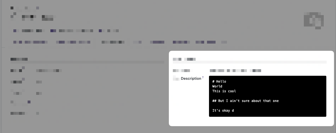
Okay, that's it for the basic overview of the Field widget, let's now create a more realistic example. With edit mode this time!
A full example, widget Markdown Editor Field
- Lifecycle hooks `onWillUpdateProps`, `onMounted`, `onWillStart`
- Bus event for emergency save with `useBus`
- Async external libs loading.
- Committing changes.
- Extracting props from XML attrs.
In this example, we will migrate the Markdown Field widget we made in another series. If you want the starting code in Odoo 15 this is the repository: https://github.com/Coding-Dodo/web_widget_markdown/tree/15.0
And the series about creating that widget:
Introduction and goals
Let's take a look at the final result.
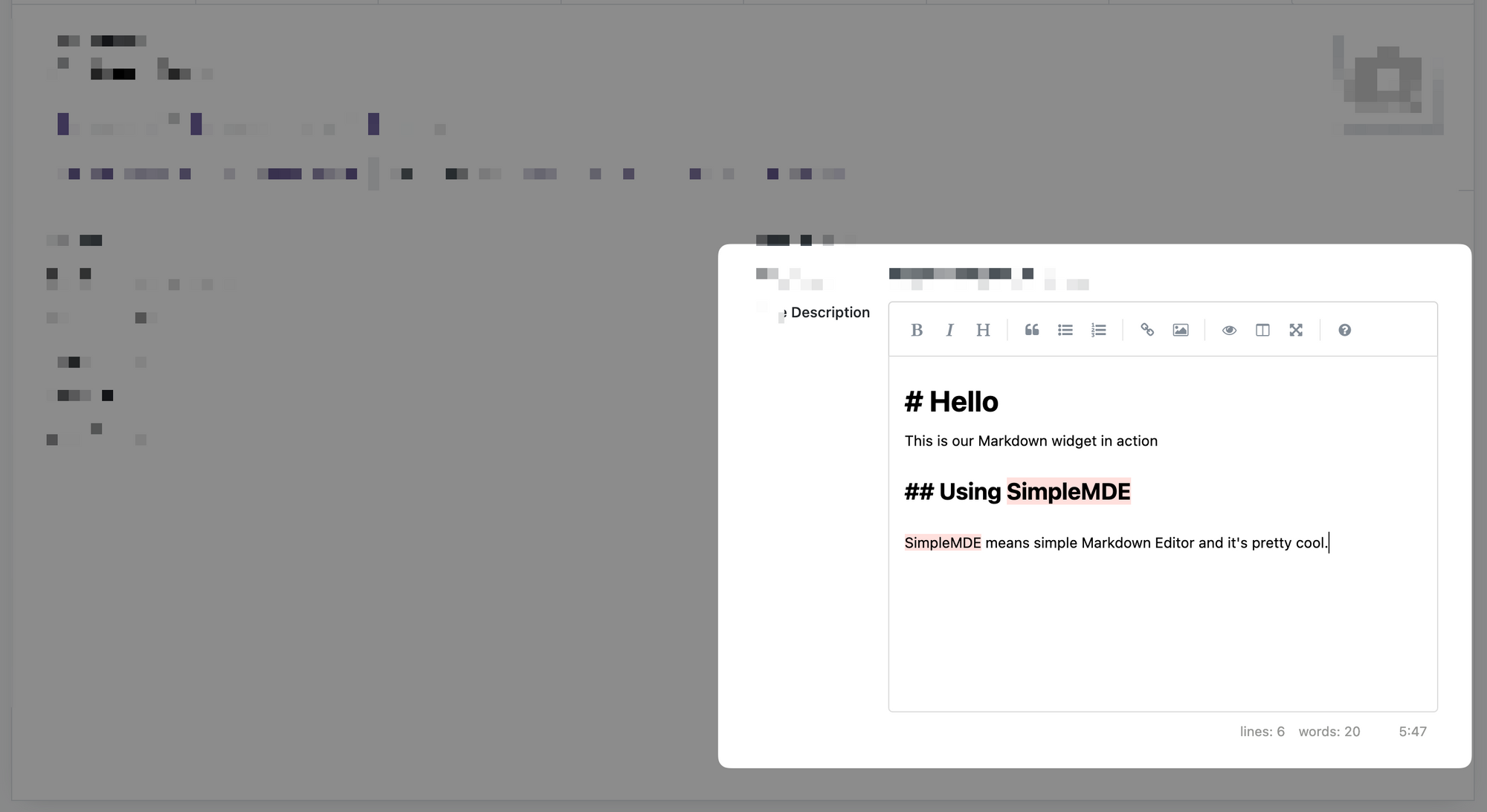
We will not go over the explanation of the library used "SimpleMDE" (Simple Markdown Editor) again, please check the articles linked just before. But to give a quick overview of the objectives:
- This widget has 2 modes, in read-only, it will show the HTML version of the markdown. In Edit mode it will show the markdown editor.
- The SimpleMDE is an Editor which will be embedded inside the Odoo Form view which itself is also an Editor!
- Changes of value inside the markdown Editor should be pushed to the actual OWL Component on "blur" (out of focus) and different events.
- Should play correctly with the auto-save feature of Odoo 16 and prevent loss of data.


