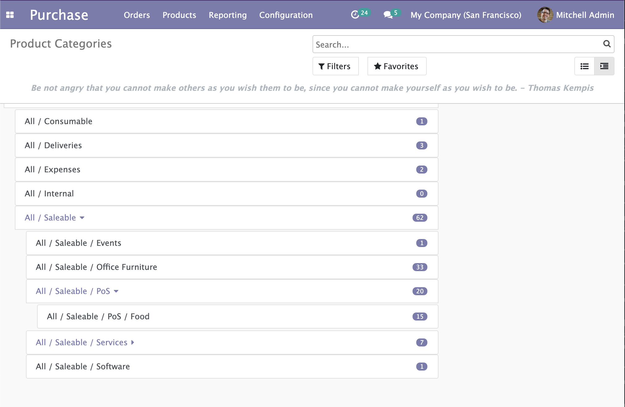
This is the third part of our ongoing tutorial series about the Odoo 14 JavaScript Framework. In the second part, we created our new type of View in OWL that displayed a hierarchical vision of parent/child type Models. The nodes are clickable and can open the child elements.

In this follow-up, we will add the drag and drop feature that will allow us to move the items and change their hierarchy.
There are some rules though:
- A parent item shouldn't be dragged and dropped into one of its own children.
- Moving an item should recalculate the count of the old parent and the new target parent should be refresh.
- An item cannot be dropped into itself.
To handle that we need to first take a look at the HTML Drag and Drop API
The HTML Drag And Drop API
In this section, I will briefly explain the HTML Drag and Drop API but if you would like a more in-depth view, take a look at this MDN Documentation.
The first step to make a DOM element draggable is adding the draggable attribute to the element and set it to true:
<div id="draggableDiv" draggable="true">This element can be dragged.</div>
The DragEvent interface
This element will then already be draggable in the browser. On top of that, it will fire multiple events. We will not cover all the events but only the ones we are interested in:
dragstartevent when the dragging begins. After a prolonged click on the draggable element, it "pops out" and can be dragged around.dragenteranddragleaveevents are events that happen on the element being dragged onto. You can know when the dragged element is entering or leaving a zone represented by another element, and make that zone react accordingly.dragoverevents trigger every few hundred milliseconds when an element is being dragged over. An element that is a valid drop target should handle that event.dropevent when the item is dropped (mouse released). If an element is a valid drop target it should handle that event.
Handling event means that we will have to ev.preventDefault() the events coming into our handler function. Fortunately for us, OWL provides us with shortcuts for that.
The DataTransfer interface
The DataTransfer is an object holding data during the drag and drop events, it can hold multiple items.
We will use this DataTransfer to pass around the tree item being drag and dropped. To do so, the interface gives u access to 2 functions:
DataTransfer.setData()Set the data for a given type. If data for the type does not exist, it is added at the end, such that the last item in the types list will be the new format. If data for the type already exists, the existing data is replaced in the same position.
event.dataTransfer.setData("text/plain", "hello world");DataTransfer.getData()Retrieves the data for a given type, or an empty string if data for that type does not exist or the data transfer contains no data.
let result = event.dataTransfer.getData("text/plain");
// result: "hello world"
Let's dive into our TreeItem Component now to make everything clearer.
Making our TreeItem draggable
Now that we know how everything works, we will update our TreeItem Component. The draggable element will be the whole <div> (without the children) and it will also be the drop zone.
Let's update static/src/components/tree_item/TreeItem.xml to reflect that:
<t t-name="owl_tutorial_views.TreeItem" owl="1">
    <div class="tree-item-wrapper">
        <div
            draggable="true"
            t-on-dragstart="onDragstart"
            t-on-drop.stop.prevent="onDrop"
            t-on-dragover.prevent="onDragover"
            t-on-dragenter.prevent="onDragenter"
            t-on-dragleave.prevent="onDragleave"
            t-attf-class="list-group-item list-group-item-action d-flex justify-content-between align-items-center owl-tree-item {{ state.isDraggedOn ? 'list-group-item-warning': '' }}"
        >
            <a href="#" t-on-click.stop.prevent="toggleChildren" t-if="props.item.child_id.length > 0">
                <t t-esc="props.item.display_name"/>
                <i t-attf-class="pl-2 fa {{ state.childrenVisible ? 'fa-caret-down': 'fa-caret-right'}}" ></i>
            </a>
            <span t-else="">
                <t t-esc="props.item.display_name"/>
            </span>
            <span
                t-if="props.countField !== '' and props.item.hasOwnProperty(props.countField)"
                class="badge badge-primary badge-pill"
                t-esc="props.item[props.countField]">
            </span>
        </div>
        <t t-if="props.item.child_id.length > 0">
            <div class="d-flex pl-4 py-1 flex-row treeview" t-if="props.item.children and props.item.children.length > 0 and state.childrenVisible">
                <div class="list-group">
                    <t t-foreach="props.item.children" t-as="child_item">
                        <TreeItem item="child_item"/>
                    </t>
                </div>
            </div>
        </t>
    </div>
</t>
We can directly use .prevent shortcuts to not have to write event.preventDefault() inside the handler function.
Notice that we also added a CSS class that triggers by checking the state of the TreeItem here {{ state.isDraggedOn ? 'list-group-item-warning': '' }}.
This will make the item become yellow-ish when dragged over. Let's now check each function we have to implement.
Handling the dragstart event
The dragstart represents the first step of the whole drag and drop operation. This is where we will set our TreeItem Object as the data to be transferred during the drag and drop.
We want to transfer the full object but the DataTransfer API setData only let us transfer strings so we will have to JSON.stringify our object first. So inside our src/components/tree_item/TreeItem.js:
onDragstart(event) {
	event.dataTransfer.setData("TreeItem", JSON.stringify(this.props.item));
}As you can see, we can transfer custom formats of data, ie "TreeItem" in our example. With that done, we will be able to get the item being moved at the end of the chain of operations.
Handling dragenter and dragleave to give visual feedback to the user.
These two events only trigger once and they will toggle the list-group-item-warning CSS class to give the user visual feedback on the component he is dragging over.
onDragenter() {
  Object.assign(this.state, { isDraggedOn: true });
}

onDragleave() {
  Object.assign(this.state, { isDraggedOn: false });
}
The code is self-explanatory on this one, let's move on to the main event.


